Neglected Volume by DGTVolume is one piece of information that is often neglected, however, learning to interpret volume brings many advantages and could be of tremendous help when it comes to analyzing the markets. In addition to technicians, fundamental investors also take notice of the numbers of shares traded for a given security.
What is Volume?
The volume represents all the recorded trades for a security that occurs in a given time interval. It is a measurement of the participation, enthusiasm, and interest in a given security. Think of volume as the force that drives the market. Volume substantiates, energizes, and empowers price. When volume increases, it confirms price direction; when volume decreases, it contradicts price direction.
In theory, increases in volume generally precede significant price movements. However, If the price is rising in an uptrend but the volume is reducing or unchanged, it may show that there’s little interest in the security, and the price may reverse.
A high volume usually indicates more interest in the security and the presence of institutional traders. However, a rapidly rising price in an uptrend accompanied by a huge volume may be a sign of exhaustion.
Traders usually look for breaks of support and resistance to enter positions. When security break critical levels without volume, you should consider the breakout suspect and prime for a reversal off the highs/lows
Volume spikes are often the result of news-driven events. Volume spike will often lead to sharp reversals since the moves are unsustainable due to the imbalance of supply and demand
note : there’s no centralized exchange where trades are recorded, so the volume data represents what happens at a particular exchange only
In most charting platforms, the volume indicator is presented as color-coded bars, green if the security closes up and red if the security closed lower, where the height of the bars show the amount of the recorded trades
Within this study, Relative Volume , Volume Weighted Bars and Volume Moving Average are presented, where Relative Volume relates current trading volume to past trading volume over long period, Volume Weighted Bars presents price bars colored based on short period past trading volume average, and Volume Moving Average is average of volume over shot period
Relative Volume is presented as color-coded bars similar to regular Volume indicator but uses four color codes instead two. Notable increases of volume are presented in green and red while average values with back and gray, hence adding ability to emphasis notable increases in the volume. It is kind of a like a radar for how "in-play" a security is. Users are allowed to change the threshold, default value is set to Fibonacci golden ration standard deviation away from its moving average.
Volume Weighted Bars, a study of Kıvanç Özbilgiç, aims to present if price movements are supported by Volume. Volume Weighted Bars are calculated based on shot period volume moving average which will reflect more recent changes in volume. Price actions with high volume will be displayed with darker colors, average volume values will remain as they are and low volume values will be indicated with lighter colors.
Volume Moving Average, Is short period volume moving average, aims to display visually the volume changes. Please not that Relative Volume bars are calculated based on standard deviation of long volume moving average.
What Else?
Apart from the volume itself, your ability to assess what volume is telling you in conjunction with price action can be a key factor in your ability to turn a profit in the market. It makes little sense to analyze the volume alone. To correctly interpret the volume data, it shall be seen in the light of what the price is doing. there are a lot of other indicators that are based on the volume data as well as price action. Analysing those volume indicators has always helped traders and investors to better understand what is happening in the market.
Here are the ones adapted with this study. Some of them used as a source for our aim, some adapted as they are with slight changes to fit visually to this study and please note that the numerical presentation may differ from their regular use
• On Balance Volume
• Divergence Indicator
• Correlation Coefficient
• Chaikin Money Flow
Shortly;
On Balance Volume
The On Balance Volume indicator, is a technical analysis indicator that relates volume flow to changes in a security’s price. It uses a cumulative total of positive and negative trading volume to predict the direction of price. The OBV is a volume-based momentum oscillator, so it is a leading indicator — it changes direction before the price
Granville, creator of OBV, proposed the theory that changes in volume precede price movements in a measurable way. He believed that volume was the main force behind major market moves and thought of OBV’s prediction of price changes as a compressed spring that expands rapidly when released.
It is believed that the OBV shows the interactions between the institutional and retail traders in the market
If the price makes a new high, the OBV should also make a new high. If the OBV makes a lower high when the price makes a higher high, there’s a classical bearish divergence — indicating that only the retail traders are buying. Another type of bearish divergence occurs when the price remains relatively quiet and fails to make a higher high but the OBV soars higher than the previous high — indicating that the institutional traders are accumulating short positions. On the other hand, if the price makes a lower low and the OBV makes a higher low, there is a classical bullish divergence, showing that the institutional traders don’t believe in that move
With this study, Momentum and Acceleration (optional) of OBV is calculated and presented, where momentum is most commonly referred to as a rate and measures the acceleration of the price and/or volume of a security. It is also referred to as a technical analysis indicator and oscillator that is able to determine market trends.
Additionally, smoothing functionality with Least Squares Method is added
Divergences especially, should always be noted as a possible reversal in the current trend, so the divergence indicator is adapted with this study where the Momentum of OBV is assumed as Oscillator with similar usages as to RSI. Divergence is most often used to track and analyze the momentum in an asset’s price and the odds of a price reversal within the current trend. The divergence indicator warns traders and technical analysts of changes in a price/volume trend, oftentimes that it is weakening or changing direction.
Correlation Coefficient
The correlation coefficient is a statistical measure of the strength of the relationship between the relative movements of two variables. A correlation of -1.0 shows a perfect negative correlation, while a correlation of 1.0 shows a perfect positive correlation. A correlation of 0.0 shows no linear relationship between the movement of the two variables. In other words, the closer the Correlation Coefficient is to 1.0, indicates the instruments will move up and down together as it is mostly expected with volume and price. So the Correlation Coefficient Indicator aims to display when the price and volume (on balance volume) is in correlation and when not. With this study blue represent positive correlation while orange negative correlation. The strength of the correlation is determined by the width of the bands, to emphasis the effect horizontal lines are drawn with values set to 0.5 and -0.5. the values above 0.5 (or below -0.5) shows stronger correlation.
Chaikin Money Flow , provide optionally as a companion indicator
The Chaikin money flow indicator (CMF) is a volume indicator that measures the money flow volume over a chosen period. The money flow volume is a measure of the volume and where the price closed relative to the trading session’s range. It comes from the idea that buying pressure is indicated by a rising volume and recurrent closes in the upper part of the session’s price range while selling pressure is demonstrated by an increasing volume and repeated closes in the lower part of the price range.
Both buying and selling pressures are accompanied by an increase in volume, but the location of the closing prices are in accordance with the direction of price
Special thanks to @InvestCHK and @hjsjshs , who have enormously contributed while preparing this study
related studies:
Disclaimer:
Trading success is all about following your trading strategy and the indicators should fit within your trading strategy, and not to be traded upon solely
The script is for informational and educational purposes only. Use of the script does not constitute professional and/or financial advice. You alone have the sole responsibility of evaluating the script output and risks associated with the use of the script. In exchange for using the script, you agree not to hold dgtrd TradingView user liable for any possible claim for damages arising from any decision you make based on use of the script
Cerca negli script per "horizontal line"

NSDT Horizontal MA LinesDisplays up to 5 moving averages as horizontal lines based on the most recent candle. It is important to remember that the line is drawn from right to left.
This gives the chart a nice clean look.
Moving average lengths can be adjusted. Line lengths can be adjusted.

Horizontal 200 Week SMAfor horizontal level traders that don't want to disregard the 200 week SMA.
Plots a horizontal line for the latest 200 week SMA value in lieu of a wavy line.
Open the indicator's settings and check the "Price Line" box for max visibility

RSI / Stoch / SRSI / MFI / Aroon Overlay [SigmaDraconis]Combines 4 popular indicators (RSI, Stoch, SRSI, MFI) and 1 peculiar one (Aroon) in 1 for those who want to save indicators but not only.
This is an evolution of my (simpler) "RSI / Stoch / Stoch RSI (SRSI) Overlay " that you can find on my scripts.
Added bands for oversold/overbought areas (70/30 common for RSI and 80/20 for SRSI and MFI), as well as a middle 50 horizontal line.
Neutral bands around 55-45 added as well that can be hidden for less clutter. I also recommend a more transparent coloring for these since Pine script doesn't allow default transparency for horizontal lines.
By default only RSI and Stoch are activated, you can activate Aroon, MFI and SRSI on the inputs window.
Some extra notes:
* RSI, Stoch and MFI can help to strengthen one's decision as well as Aroon to predict a possible trend reversal, SRSI can show when RSI has high probability of being topped or bottomed when oversold/overbought but don't forget to look at volume and how the trend progresses that can keep SRSI above 80 or below 20 while RSI and price continues to trend, divergences are most helpful here to find possible reversal areas.
* This chart depicts some interesting divergences, as well as Stoch tops and bottoms and confluences between RSI/MFI and Stoch on some over-extended tops and bottoms that shown being good reversal zones.
RSI resistances are shown as well, failing to break above 60 or the neutral zone (this is a bearish BTC trend chart after all) or failing to gain support to break up certain levels (RSI notes a more bullish trend when consistently above 60 and more bearish below 40).
If you like it and use it to profit, please tip me below :)
Tip jars:
BTC: 15nMBiEGVrdGcu9C1h6QRcTNRvugHkqrMQ
ETH: 0xC33845946c48B61fBCbEA0367ec2238CaF2b73bc
BTS: sigma-draconis

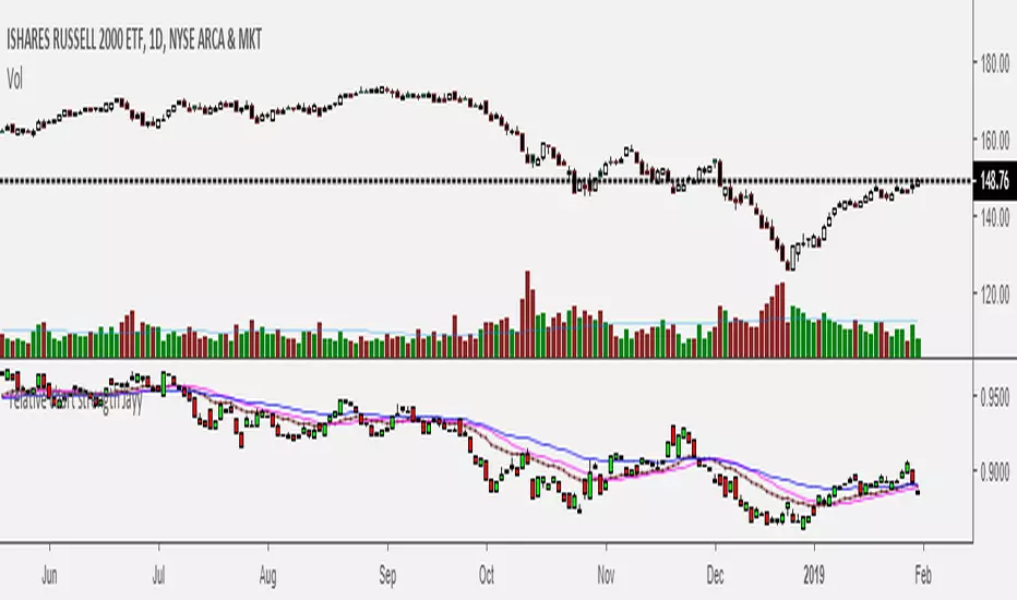
Relative Strength of 2 securities - Jayy This is an update of the Relative Strength to index as used by Leaf_West.. 4th from the top. my original RS script is 3rd from the top.
In this use of the term " Relative Strength" (RS) what is meant is a ratio of one security to another.
The RS can be inerpreted in a fashion similar to price action on a regual security chart.
If you follow his methods be aware of the different moving averages for the different time periods.
From Leaf_West: "on my weekly and monthly R/S charts, I include a 13 EMA of the R/S (brown dash line) and
an 8 SMA of the 13 EMA (pink solid line). The indicator on the bottom of the weekly/monthly charts is an
8 period momentum indicator of the R/S line. The red horizontal line is drawn at the zero line.
For daily or 130-minute time periods (or shorter), my R/S charts are slightly different
- the moving averages of the R/S line include a 20EMA (brown dash line), a 50 EMA (blue dash line) and
an 8 SMA of the20 EMA (pink solid line). The momentum indicator is also slightly different from the weekly/monthly
charts – here I use a 12 period calculation (vs 8 SMA period for the weekly/monthly charts)."
Leaf's website has gone but I if you are interested in his methods message me.
What is different from my previous RS: The RS now displays RS candles. So if you prefer to watch price action of candles to
a line chart which only plots the ratio of closes then this will be more interesting to you.
I have also thrown in a few options to have fun with.
Jayy
Momentum of Relative strength to Index Leaf_West styleMomentum of Relative Strength to index as used by Leaf_West. This is to be used with the companion Relative Strength to Index indicator Leaf_West Style. Make sure you use the same index for comparison. If you follow his methods be aware of the different moving averages for the different time periods. From Leaf_West: "on my weekly and monthly R/S charts, I include a 13 EMA of the R/S (brown dash line) and an 8 SMA of the 13 EMA (pink solid line). The indicator on the bottom of the weekly/monthly charts is an 8 period momentum indicator of the R/S line. The red horizontal line is drawn at the zero line.
For daily or 130-minute time periods (or shorter), my R/S charts are slightly different - the moving averages of the R/S line include a 20EMA (brown dash line), a 50 EMA (blue dash line) and an 8 SMA of the20 EMA (pink solid line). The momentum indicator is also slightly different from the weekly/monthly charts – here I use a 12 period calculation (vs 8 SMA period for the weekly/monthly charts)." Leaf's methods do evolve and so watch for any changes to the preferred MAs etc..
Relative strength to Index set up as per Leaf_WestRelative Strength to index as used by Leaf_West. If you follow his methods be aware of the different moving averages for the different time periods. From Leaf_West: "on my weekly and monthly R/S charts, I include a 13 EMA of the R/S (brown dash line) and an 8 SMA of the 13 EMA (pink solid line). The indicator on the bottom of the weekly/monthly charts is an 8 period momentum indicator of the R/S line. The red horizontal line is drawn at the zero line.
For daily or 130-minute time periods (or shorter), my R/S charts are slightly different - the moving averages of the R/S line include a 20EMA (brown dash line), a 50 EMA (blue dash line) and an 8 SMA of the20 EMA (pink solid line). The momentum indicator is also slightly different from the weekly/monthly charts – here I use a 12 period calculation (vs 8 SMA period for the weekly/monthly charts)." Leaf's methods do evolve and so watch for any changes to the preferred MAs etc..

SMA Reversal Sequential MTFSMA Reversal Sequential MTF (Multi-Timeframe)OverviewThe SMA Reversal Sequential MTF is a professional-grade price action tool designed to detect qualitative trend shifts and structural breakouts across multiple timeframes simultaneously. Unlike standard crossover indicators, this script analyzes the "curvature" of the Simple Moving Average (SMA) to identify when the market's average momentum has genuinely rotated.1. Core Logic: SMA Slope CurvatureThe script detects a trend reversal when the SMA (20-period by default) changes its trajectory from a "V-shape" (bottoming out) or an "Inverted V-shape" (topping out).The Reversal Algorithm:Bullish Reversal: Occurs when the SMA value at a specific historical offset is higher than the intermediate offset, but the intermediate offset is lower than the most recent value.Bearish Reversal: Occurs when the SMA value at a specific historical offset is lower than the intermediate offset, but the intermediate offset is higher than the most recent value.By using an OFFSET parameter, the script filters out minor price noise, ensuring that only significant rotations in the moving average are labeled.2. Structural Breakout Detection (MSB)Once a reversal is confirmed, the script automatically identifies the Market Structure of that specific timeframe by looking back at the highest high or lowest low within a defined period (LOOKBK).How Breakouts Work:Level Anchoring: When a reversal is detected, the script "locks in" the highest/lowest price of that swing.Confirmation: A "BREAK" signal and a horizontal line are generated only when a candle closes beyond this structural level.Visual Persistence: The break-line is extended to the right, providing a clear visual reference for support-turned-resistance (or vice versa).3. Advanced Multi-Timeframe (MTF) IntegrationMonitor up to 6 timeframes (5M, 15M, 1H, 4H, 1D, 1W) on a single chart.Auto-Filtering (hideLowerTF): To maintain chart clarity, the script can automatically hide timeframe data that is lower than your current chart (e.g., if you are on a 1H chart, 5M and 15M labels are hidden).Non-Repainting: Built using barmerge.gaps_on and confirmed candle logic, ensuring that historical signals remain accurate and do not disappear or move after the fact.4. Dual Preset ModesSwitch between two specialized trading styles with a single click in the settings:PresetParameters (SMA / Offset / Lookback)Ideal ForStandard (Default)20 / 6 / 20Trend following, swing trading, and major pullbacks.Short-Term5 / 4 / 7Scalping, fast day trading, and sensitive structure shifts.5. Visual Interface FeaturesTimeframe Labels: Clearly indicates which timeframe has rotated (e.g., "1H", "15M").Dynamic BREAK Labels: Labels follow the price action with a customizable right-side offset, ensuring they never overlap with the candles.Memory Management: Uses Pine Script Arrays to manage objects, ensuring the script runs smoothly without hitting the platform's drawing limits.6. How to Trade with This ScriptConfluence Trading: Wait for a "BREAK" on a higher timeframe (e.g., 4H) and then look for a matching "REVERSAL" on a lower timeframe (e.g., 15M) to refine your entry.Trailing Stops: Use the structural breakout lines as logical levels for stop-loss placement or profit-taking targets.Technical SpecificationsLanguage: Pine Script v5Overlay: YesAlerts: Compatible with standard alert functions.
このインジケーターは、**「トレンドの質的な転換」と「構造的な重要水準の打破(ブレイク)」**を、マルチタイムフレーム(MTF)で同時に監視する総合的なプライスアクションツールです。1. コア・コンセプト:SMA Reversal通常の移動平均線クロスオーバーとは異なり、このスクリプトは**SMA(単純移動平均線)の「曲率(カーブ)」**に着目します。判定アルゴリズムSMAが「下落から上昇」または「上昇から下落」へ変化する瞬間を、特定のオフセット(間隔)を用いて検知します。上昇転換(V字回復): NYSE:SMA > SMA $ かつ NYSE:SMA < SMA $下落転換(逆V字): NYSE:SMA < SMA $ かつ NYSE:SMA > SMA $これにより、価格の一時的なノイズに惑わされず、移動平均線という「相場の平均的な意思」が明確に方向を変えたタイミングを捉えます。2. 構造的ブレイクアウトの検知転換が確認された際、スクリプトはその時点から遡って過去LOOKBK期間内の最高値・最安値を特定します。これが「構造的なレジスタンス・サポート」として機能します。ブレイクの定義水準の固定: 転換が発生した瞬間の高値・安値を、その時間足の「重要ライン」として記憶します。確定足での判定: 終値がそのラインを明確に上抜いた(または下抜いた)時、チャート上に "BREAK" ラベルと水平線を表示します。3. マルチタイムフレーム(MTF)機能このインジケーターの最大の強みは、1つのチャート上に最大6つの時間足(5M, 15M, 1H, 4H, 1D, 1W)の状態を重ねて表示できる点です。自動フィルタリング: hideLowerTF 設定により、5分足チャートを見ている時は全時間足を表示し、日足チャートを見ている時は日足と週足のみを表示するといった、視認性の自動最適化が行われます。非リペイント処理: barmerge.gaps_on を使用した request.security 処理により、過去の検証データにおいて「未来の情報を参照して描画する」リペイント現象を防いでいます。4. 2つのプリセット設定ユーザーは相場の性質に合わせて、設定画面のチェックボックス一つで計算ロジックを切り替えられます。設定名SMA期間 / オフセット / 参照期間特徴標準 (規定値)20 / 6 / 20中長期的なトレンド転換を捉える。押し目買い・戻り売りに最適。短期 (Short)5 / 4 / 7スキャルピングや短期デイトレ用。微細な構造の変化を素早く察知。5. 視覚的インターフェースの説明転換ラベル (5M, 1H等): その時間足でSMAの転換が確定したポイント。常に「最新の1つ」のみが表示されるため、チャートが煩雑になりません。BREAKラベル & ライン: 構造が破壊された価格水準。ラインは右側に延長され、現在の価格との距離感がひと目で分かります。右オフセット: ブレイクラベルを現在価格より右側に配置することで、ローソク足とラベルが重なるのを防ぎます。6. 推奨される活用法上位足のBREAKを待つ: 例えば、1時間足で "1H BREAK" が出ている方向にのみ、5分足や15分足でエントリーを仕掛ける「環境認識」のツールとして非常に強力です。損切りの目安: 表示されたブレイクラインの反対側に価格が戻ってきた場合、構造が否定されたと判断し、迅速な撤退の根拠にできます。技術仕様(開発者向け)言語: Pine Script v5描画制限: 常に最新のオブジェクト(ライン・ラベル)のみを保持するように配列(Array)でメモリ管理を行っており、TradingViewの描画制限エラーを回避しています。計算コスト: request.security を効率的に呼び出しているため、複数の時間足を表示しても動作は軽快です。


Max. Liquidity & Delta Bias Profile @MaxMaserati 3.0MAX. LIQUIDITY & DELTA BIAS PROFILE @MAXMASERATI 3.0
═══════════════════════════════════════════════════════════════
OVERVIEW
────────
An advanced volume profile tool that analyzes market liquidity and order flow dynamics across different timeframes. This indicator helps traders identify key price levels where significant trading activity and directional bias converge.
DUAL PROFILE SYSTEM
───────────────────
🔷 LIQUIDITY PROFILE (Right Side)
Displays total volume traded at each price level, colored by market bias:
• Green nodes = Bullish dominance (buyers in control)
• Red nodes = Bearish dominance (sellers in control)
• Width represents volume concentration at that level
🔷 DELTA BIAS PROFILE (Left Side)
Shows net buying vs selling pressure at each price level:
• Blue nodes = Positive delta (buying pressure dominates)
• Purple nodes = Negative delta (selling pressure dominates)
• Width represents strength of the imbalance
KEY REFERENCE LEVELS
─────────────
📍 POC (Point of Control)
Yellow horizontal line marking the price with highest traded volume - represents the most accepted fair value during the period.
📍 MAX BULL Level
Green line highlighting the price with strongest bullish conviction - where buyers showed maximum aggression and commitment.
📍 MAX BEAR Level
Red line highlighting the price with strongest bearish conviction - where sellers demonstrated maximum pressure and control.
TOGGLE OFF EVERYTHING EXCEPT THE MAX LINES TO HAVE THIS SETUP
PROFILE STATUS INDICATORS
──────────────────────────
• ▶ ONGOING (Green) = Current developing profile
• ⬛ STOPPED (Red) = Completed profile, new period started
CUSTOMIZATION FEATURES
──────────────────────
✓ Multiple anchor periods (Auto/Session/Day/Week/Month/Quarter/Year)
✓ Independent toggles for each visual element
✓ Individual color and size controls for every label
✓ Adjustable profile width and transparency
✓ Customizable line widths and styles
TRADING APPLICATIONS
────────────────────
• Identify high-probability support/resistance zones
• Spot institutional accumulation/distribution levels
• Detect order flow imbalances before major moves
• Track intraday value areas and fair price zones
• Confirm trend strength through delta analysis
• Find optimal entry/exit levels based on volume
WHO THIS IS FOR
───────────────
Designed for active traders who:
• Trade futures, stocks, forex with volume data
• Use volume profile and market profile concepts
• Analyze order flow and institutional footprints
• Seek data-driven price level identification
• Want visual clarity on market structure
NOTES
─────
• Requires volume data to function properly
• Best used on liquid instruments with consistent volume
• Profiles reset based on selected anchor period
• All visual elements can be toggled independently
• Performance optimized for real-time analysis
⚠️ DISCLAIMER
Educational Tool Only - This indicator is for educational and informational purposes only and does not constitute financial, investment, or trading advice.
Risk Warning - Trading involves substantial risk of loss and is not suitable for all investors. Past performance does not guarantee future results. No representation is made that this indicator will achieve profits or prevent losses.
User Responsibility - All trading decisions are solely your responsibility. The developer and Max Maserati Model assume no liability for losses incurred from using this indicator. Conduct your own research and consult a qualified financial advisor before making investment decisions.
Data Dependency - Indicator accuracy depends on your TradingView plan's data availability and selected timeframe support.
By using this indicator, you acknowledge and agree to these terms.

4H HOD/LOD Checkpoint Analysis4H HOD/LOD Checkpoint Analysis - Detailed User Guide
OVERVIEW
This indicator is a data-driven probability framework for NQ Futures traders that predicts High-of-Day (HOD) and Low-of-Day (LOD) placement based on statistical analysis of 3,136+ trading days (2013-2025). Unlike traditional indicators that rely on technical signals, this tool uses checkpoint-based state analysis with zero forward-looking bias to provide real-time probabilities of whether the daily range is complete.
⚠️ IMPORTANT: This indicator is specifically designed for NQ FUTURES ONLY. All probabilities, patterns, and statistics were derived from a 10+ year historical dataset of NQ 1-minute bars. Using this on other instruments will produce inaccurate results.
CORE CONCEPT: CHECKPOINT METHODOLOGY
What is a Checkpoint?
A checkpoint occurs when a 4-hour candle closes. At this moment, the indicator "locks" the current market state and calculates probabilities for the remainder of the trading day. The key innovation is that state never changes after locking - probabilities remain constant throughout the session until the next checkpoint.
The Six 4-Hour Candles (EST):
6PM (18:00-22:00) - Evening/Globex open
10PM (22:00-02:00) - Asia session
2AM (02:00-06:00) - Early London
6AM (06:00-10:00) - Late London + NY Open
10AM (10:00-14:00) - NY Morning
2PM (14:00-17:00) - NY Afternoon (3 hours only)
Five Checkpoints:
10PM Checkpoint - After 6PM closes
2AM Checkpoint - After 10PM closes
6AM Checkpoint - After 2AM closes
10AM Checkpoint - After 6AM closes (most critical)
2PM Checkpoint - After 10AM closes (highest conviction fade signals)
HOW IT WORKS: THE THREE-FACTOR STATE SYSTEM
At each checkpoint, the indicator evaluates three critical factors to determine probability:
1. ELIMINATIONS (Quantity)
An "elimination" occurs when a candle trades beyond a previous candle's high or low, effectively removing that candle from contention for HOD/LOD.
Example at 10AM Checkpoint:
6PM high = 18,000
10PM high = 18,050 (eliminates 6PM high)
2AM high = 18,100 (eliminates 10PM high)
6AM high = 18,075 (does NOT eliminate 2AM high)
Result: 2 eliminations
The number of eliminations indicates trend strength:
0 eliminations = Range-bound, high probability extremes already set
1-2 eliminations = Moderate trend
3-4 eliminations = Strong trend day, range likely to extend
2. STRUCTURE (Pattern Type)
The indicator distinguishes between two elimination patterns:
Sequential: Eliminations occur in order (6pm → 10pm → 2am → 6am → 10am)
Indicates smooth, consistent trend
Example: 10pm eliminates 6pm, then 2am eliminates 10pm (sequential)
Skip: Eliminations skip candles
Indicates choppy/reversal behavior
Example: 2am eliminates 6pm but NOT 10pm (skip pattern)
Why it matters: Skip patterns show 2X probability differences compared to sequential patterns. At 10AM checkpoint with 2 eliminations, skip pattern shows 64% participation rate vs 36% for sequential pattern with previous survived.
3. PREVIOUS CANDLE STATUS
Did the immediately prior candle get eliminated?
Eliminated: Previous candle's high/low was taken out
Indicates relentless trend
Higher probability of continuation
Survived: Previous candle's high/low still intact
Indicates trend pause
Higher probability of mean reversion or range completion
Critical insight: High and low are tracked separately. At 2AM checkpoint, 10PM might have eliminated 6PM high (relentless uptrend) but NOT eliminated 6PM low (low survived). This creates different probabilities for HOD vs LOD.
VISUAL ELEMENTS
4-Hour Candle Boxes
Each 4H candle is displayed as a colored box showing its range:
Gray = 6PM (evening)
Blue = 10PM (Asia)
Purple = 2AM (early London)
Orange = 6AM (London + NY Open) - THE CURVE SESSION
Teal = 10AM (NY morning) - THE MONEY SESSION
Red = 2PM (NY afternoon) - THE FADE SESSION
HOD/LOD Lines
Black horizontal lines extend from current HOD/LOD with labels showing:
Which candle set the extreme
Current price level
THE CHECKPOINT TABLE EXPLAINED
Table Header:
Shows current checkpoint (e.g., "🎯 10AM CHECKPOINT") or "⏳ PRE-CHECKPOINT" if between checkpoints.
Main Metrics (Side-by-Side Comparison):
The table displays HOD and LOD separately in two columns because they can have different patterns:
METRIC
HODLOD Eliminations
Number of candles eliminated so far for highs
Number of candles eliminated so far for lows
Structure
Sequential or Skip pattern for highs
Sequential or Skip pattern for lows
Prev Candle
Was previous candle's high eliminated or did it survive?
Was previous candle's low eliminated or did it survive?
Pattern
Combined interpretation: Relentless/Paused/Skip/Early
Combined interpretation: Relentless/Paused/Skip/Early
Color Coding:
Structure Row:
White = Sequential (smooth trend)
Orange = Skip (choppy/reversal)
Previous Candle Row:
Red = Eliminated (relentless trend continuing)
Blue = Survived (trend paused)
Pattern Row:
Red = Relentless (previous eliminated + sequential = strong trend)
Blue = Paused (previous survived + sequential = trend pause)
Orange = Skip/Chop (skip pattern = reversal likely)
Gray = Early (0-1 eliminations, too early to tell)
Probability Section:
Prob Already In: Percentage chance that HOD/LOD has already been set
Color coding:
Green (>75%) = High confidence extreme is in, FADE
Yellow (45-75%) = Moderate confidence
Red (<45%) = Low confidence extreme is in, CONTINUATION likely
Sample Size: Shows how many historical occurrences match this exact state (n=XXX)
Larger samples = higher confidence
Most common states have n=500-2,000+
Current: Which candle currently holds HOD/LOD
Pattern Guide Section:
Appears when you have 2+ eliminations. Provides interpretation:
📈 Paused: Trend has paused, 2pm more likely to set extreme
📈 Relentless: Breaking higher/lower, continuation expected
📈 Skip/Chop: Choppy pattern, next session likely
Same for lows with 📉 symbol.
PRACTICAL TRADING EXAMPLES
Example 1: High Conviction Fade Setup
State at 10AM Checkpoint:
Eliminations: 0 (both HOD/LOD)
Structure: None (no eliminations yet)
Prev Candle: Survived
Table shows:
HOD Prob Already In: 68.9% (n=582)
LOD Prob Already In: 73.6% (n=785)
Interpretation: Range is likely complete. Fade extremes. With 0 eliminations and 70%+ probability, this is a high-conviction mean reversion signal.
Example 2: Strong Continuation Signal
State at 10AM Checkpoint:
Eliminations: 3 (both HOD/LOD)
Structure: Sequential
Prev Candle: Eliminated (relentless)
Table shows:
HOD Prob Already In: 29.8% (n=1,758)
LOD Prob Already In: 34.6% (n=1,451)
Pattern: 📈 Relentless / 📉 Relentless
Interpretation: Strong trend day. Only 30-35% chance range is complete. Look for breakouts in direction of trend. 10AM and 2PM likely to extend range.
Example 3: Pattern Structure Edge
State at 10AM Checkpoint:
Eliminations: 2 (HOD)
Structure: Skip (orange background)
Prev Candle: Eliminated vs Alternative State:
Eliminations: 2 (HOD)
Structure: Sequential
Prev Candle: Survived
Result: Skip pattern shows 64% chance 10AM participates vs 36% for sequential+survived. Skip pattern = 2X more likely to see 10AM high. This structural edge is unique to this indicator.
Example 4: Different HOD vs LOD Patterns
State at 10AM Checkpoint:
HOD: 2 eliminations, Sequential, Previous Eliminated (Relentless) = 46.7% in
LOD: 2 eliminations, Skip, Previous Eliminated (Choppy) = 48.4% in
Interpretation: Highs show relentless uptrend but lows show choppy behavior. This divergence suggests potential for upside continuation but with volatility. Not a clean trend day.
KEY CHECKPOINT STATISTICS (DERIVED FROM 10-YEAR DATASET)
10PM Checkpoint (After 6PM):
Very early in day
13.5% HOD in, 21.3% LOD in
Most likely outcome: Range extends into 6AM/10AM
2AM Checkpoint (After 10PM):
Still early
With 0 elims: 22-31% in (balanced)
With 1 elim: 8-12% in (strong trend signal)
6AM Checkpoint (After 2AM) - Critical Decision Point:
With 0 elims: 40-47% in (balanced, could go either way)
With 2 elims: 18-22% in (strong trend into 6AM/10AM)
Most likely outcome: 10AM sets extremes (~38-40%)
10AM Checkpoint (After 6AM) - Highest Conviction:
With 0 elims: 69-74% in → FADE (high confidence)
With 3 elims: 30-35% in → BUY/SELL continuation
This is THE money checkpoint for high-probability setups
2PM Checkpoint (After 10AM) - Maximum Fade Conviction:
With 0-3 elims: 67-95% in → FADE strongly
With 4 elims: 49-61% in (monster trend, weaker fade)
2PM is primarily a mean reversion session
UNDERSTANDING THE UNDERLYING DATA
All probabilities are derived from analysis of:
Instrument: NQ Futures (E-mini NASDAQ-100)
Timeframe: 1-minute bars
Period: January 2013 - December 2025
Sample: 3,136+ complete trading days
Methodology: Real-time checkpoint analysis with zero forward-looking bias
Why NQ-Specific?
Each futures contract has unique:
Session characteristics (6AM in NQ shows 60-64% curve behavior, other sessions differ)
Timing patterns (NQ's 10AM session has 67-74% immediate takeouts)
Volatility profiles (NQ 2PM shows 56% bullish bias vs ES shows different bias)
Using this indicator on ES, RTY, or other instruments will produce inaccurate results because the probability tables are NQ-specific.
ORIGINALITY & INNOVATION
What Makes This Indicator Unique:
Zero Forward-Looking Bias: State locks at checkpoint moments. Traditional indicators recalculate continuously, introducing bias. This indicator freezes probabilities at the exact moment a 4H candle closes.
Three-Factor State System: Combines elimination count, structure pattern, and previous candle status. Most indicators only track one dimension. This multi-factor approach provides 2X+ probability differentials.
Separate HOD/LOD Tracking: Highs and lows can have different patterns simultaneously (relentless high with choppy low). This indicator tracks them separately for precision.
Pattern Structure Analysis: Distinguishes between sequential and skip patterns, a concept not found in standard indicators. Skip patterns show mean reversion while sequential shows continuation.
10+ Year Statistical Foundation: Every probability is backed by hundreds to thousands of historical occurrences (sample sizes shown in table). Not based on theories or assumptions.
Checkpoint-Specific Probabilities: Different checkpoints have different probability profiles. 10AM checkpoint with 0 eliminations = 70%+ fade. 6AM checkpoint with same state = 40%+ fade. Context matters.
HOW TO USE THIS INDICATOR
Step 1: Wait for Checkpoint
The table will show "⏳ PRE-CHECKPOINT" until a 4H candle closes. Probabilities are only valid at checkpoint moments.
Step 2: Read the State
Check the three factors:
How many eliminations?
Sequential or skip?
Previous candle eliminated or survived?
Step 3: Check Probability
Look at "Prob Already In" percentage:
>75% (Green) = High confidence extreme is set, fade
45-75% (Yellow) = Moderate confidence, use other confirmation
<45% (Red) = Low confidence extreme is set, continuation likely
Step 4: Check Sample Size
Larger sample (n=1,000+) = higher confidence
Smaller sample (n=50-200) = use caution, edge is real but less robust
Step 5: Consider Pattern
Read the pattern guide:
Relentless = trend continuing
Paused = trend stalled, mean reversion
Skip/Chop = reversal/range likely
Step 6: Compare HOD vs LOD
If both show similar patterns = cleaner signal
If divergent patterns = complex day, be cautious
BEST PRACTICES
Focus on 10AM and 2PM checkpoints - These have the highest conviction signals
Combine with price action - Don't fade blindly at 90% probability if price is breaking out strongly
Larger samples = better edges - Prioritize setups with n=500+
Watch for pattern divergence - When HOD and LOD show different patterns, expect complexity
Remember session characteristics:
6AM = THE CURVE SESSION (60-64% mean reversion when Q2 breaks Q1)
10AM = THE MONEY SESSION (67-74% immediate takeouts, highest conviction)
2PM = THE FADE SESSION (67-95% extremes already in)
SETTINGS
Show 4H Candle Boxes - Display colored boxes for each 4H candle
Show HOD/LOD Lines - Display horizontal lines at current extremes
Show Checkpoint Analysis - Display probability table
Table Position - Choose where to place the checkpoint table
Table Size - Tiny/Small/Normal
Colors - Customize box colors for each session
LIMITATIONS & DISCLAIMERS
NQ FUTURES ONLY - Do not use on other instruments
Not a standalone system - Use as confluence with your strategy
Historical data - Past performance doesn't guarantee future results
Sample size variance - Some states have smaller samples, use judgment
Requires understanding - Read this guide fully before trading with this tool
FINAL NOTES
This indicator represents 10+ years of NQ futures data distilled into actionable, real-time probabilities. The checkpoint methodology ensures zero forward-looking bias, while the three-factor state system provides granular edge that traditional indicators miss.
Remember: This tool provides probabilities, not certainties. Trade with proper risk management, and use this as one input in your decision-making process.

Dimensional Support ResistanceDimensional Support Resistance
Overview
Dimensional Support Resistance is an open-source overlay indicator that automatically detects and displays clean, non-overlapping support and resistance levels using pivot-based analysis with intelligent filtering. It identifies significant swing highs and lows, filters them by minimum distance to prevent visual clutter, and provides volume-confirmed bounce signals.
What This Indicator Does
The indicator calculates and displays:
Dynamic Pivot Levels - Automatically detected swing highs and lows based on configurable pivot strength
Distance Filtering - Ensures levels are spaced apart by a minimum percentage to prevent overlap
S/R Zones - Visual zones around each level showing the price area of significance
Bounce Detection - Identifies when price reverses at support or resistance levels
Volume Confirmation - Strong signals require above-average volume for confirmation
How It Works
Pivot detection scans for swing highs and lows using a configurable strength parameter. A pivot low requires the low to be lower than all surrounding bars within the strength period.
Signal Generation
The indicator generates bounce signals using TradingView's built-in pivot detection combined with candle reversal confirmation:
Support Bounce: Pivot low forms with bullish close (close > open)
Resistance Bounce: Pivot high forms with bearish close (close < open)
Strong Bounce: Bounce occurs with volume 1.5x above 20-period average
A cooldown period of 15 bars prevents signal spam.
Dashboard Panel
A compact dashboard displays:
Support - Count of active support levels
Resistance - Count of active resistance levels
Dashboard position is configurable (Top Left, Top Right, Bottom Left, Bottom Right).
Visual Elements
Support Lines - Green horizontal lines at support levels
Resistance Lines - Red horizontal lines at resistance levels
S/R Zones - Semi-transparent boxes around levels showing zone width
Price Labels - S: and R: labels showing exact price of nearest levels
BOUNCE Markers - Triangle shapes with text when price bounces at a level
STRONG Markers - Label shapes when bounce occurs with high volume
Input Parameters
Lookback Period (default: 100) - Historical bars to scan for pivots
Pivot Strength (default: 8) - Bars on each side required for valid pivot (higher = fewer but stronger levels)
Max Levels Each Side (default: 2) - Maximum support and resistance levels displayed
Zone Width % (default: 0.15) - Width of zones around each level as percentage of price
Min Distance Between Levels % (default: 1.0) - Minimum spacing between levels to prevent overlap
Show S/R Zones (default: true) - Toggle zone visualization
Show Bounce Signals (default: true) - Toggle signal markers
Support Color (default: #00ff88) - Color for support elements
Resistance Color (default: #ff3366) - Color for resistance elements
Suggested Use Cases
Identify key support and resistance levels for entry and exit planning
Use bounce signals as potential reversal confirmation
Combine with other indicators for confluence-based trading decisions
Monitor strong signals for high-probability setups with volume confirmation
Timeframe Recommendations
Works on all timeframes. Higher timeframes (4H, Daily) provide more significant levels with fewer signals. Lower timeframes show more granular structure but may produce more noise.
Limitations
Pivot detection requires lookback bars, so very recent pivots may not be immediately visible
Bounce signals are based on pivot formation and may lag by the pivot strength period
Levels are recalculated on each bar, so they may shift as new pivots form
Open-Source and Disclaimer
This script is published as open-source under the Mozilla Public License 2.0 for educational purposes. It does not constitute financial advice. Past performance does not guarantee future results. Always use proper risk management and conduct your own analysis before trading.
- Made with passion by officialjackofalltrades

4H & Daily Previous Candle + Fibonacci + OTE# Multi-Timeframe OTE & Fibonacci Indicator (4H & Daily)
This Pine Script v5 indicator is designed for traders who utilize **Optimal Trade Entry (OTE)** zones and **Fibonacci retracements** based on higher timeframe market structures. It automatically identifies and plots key levels from the previous 4-hour and Daily candles to help find high-probability reversal zones.
## Key Features
### 1. Dual Timeframe OTE Zones
- **4H OTE Zone**: Automatically calculates and shades the Optimal Trade Entry area (default 61.8% - 78.6%) based on the previous 4-hour candle's range.
- **Daily OTE Zone**: Plots a secondary OTE zone based on the previous Daily candle, allowing for multi-timeframe confluence analysis.
- **Dynamic Adaptation**: The zones automatically flip based on whether the previous candle was bullish or bearish, ensuring you are always looking at the correct retracement levels.
### 2. Automated Market Structure
- **High/Low Tracking**: Plots clear horizontal lines for the previous 4H and Daily Highs and Lows.
- **Visual Distinction**: Daily levels are highlighted with thicker lines to distinguish them from 4H levels.
- **Price Labels**: Displays real-time price labels for all structural levels for quick reference.
### 3. Customizable Fibonacci Retracements
- **4H Fibonacci Levels**: Plots standard retracement levels (23.6%, 38.2%, 50%, 61.8%, 78.6%) for the 4H timeframe.
- **Fully Adjustable**: Users can input custom Fibonacci levels via the settings menu.
### 4. Real-Time Information Dashboard
- **Range Summary**: A clean table in the top-right corner displays the total pip/point range for both the previous 4H and Daily candles.
- **Clean UI**: All visual elements (colors, line widths, labels) can be toggled or customized to fit any chart theme.
## How to Use
This indicator is ideal for "Smart Money" or "ICT" style trading. Look for **confluence** where the 4H OTE zone overlaps with the Daily OTE zone or other key structural levels to identify high-precision entry points.

4H Previous Candle + FibonacciIndicator Description: 4H Previous Candle + Fibonacci
This Pine Script (v5) indicator is a technical analysis tool designed for traders using the
TradingView platform. It allows for the visualization of key levels from the previous 4-
hour candle directly on any lower time frame.
1. Primary Objective
The indicator aims to provide a Higher Time Frame (HTF) perspective automatically.
By plotting the high, low, and Fibonacci retracement levels of the last closed 4H
candle, it helps identify institutional support and resistance zones without the need to
constantly switch time frames.
2. Key Features
Feature Description
Automatic 4H Levels
Automatically plots horizontal lines for the High and Low of the
previous 4H candle.
Dynamic Adaptation
Line colors and styles adapt based on whether the candle was
bullish (green) or bearish (red).
Fibonacci
Retracements
Calculates and displays customizable Fibonacci levels (e.g., 23.6%,
38.2%, 50%, 61.8%, 78.6%).
Dashboard (HUD)
A summary table in the top-right corner displays exact values and
the candle type.
3. Technical Functionality
Data Retrieval (Multi-Timeframe)
The script uses the request.security function to extract data from the 4-hour time
frame (“240”). Using the index ensures the indicator is based on a closed candle,
eliminating any risk of “repainting” (levels changing during formation).
Fibonacci Calculation Logic
The calculation of Fibonacci levels is intelligent and directional:
Bullish Candle: The retracement is calculated from bottom to top (0% is at the
bottom).
Bearish Candle: The retracement is calculated from top to bottom (0% is at the
top).
4. Configuration Parameters
Users can customize the indicator via the settings menu:
Visual Settings: Toggle lines, adjust thickness, price labels, and decimal
precision.
Fibonacci Settings: Enable levels, choose colors, line thickness, and enter
custom retracement percentages.
5. Trading Use Cases
Bounce Zones: The 50% and 61.8% levels of the previous 4H candle are often
considered “Premium” or “Discount” zones where price tends to react.
Confluence: Use these levels alongside other indicators (RSI, moving averages)
to confirm entry points.
Risk Management: Place Stop Losses just beyond the previous 4H High or Low.
Document generated for the analysis of the “4H Previous Candle + Fibonacci” Pine
Script.

Session Volume Analyzer [JOAT]
Session Volume Analyzer — Global Trading Session and Volume Intelligence System
This indicator addresses the analytical challenge of understanding market participation patterns across global trading sessions. It combines precise session detection with comprehensive volume analysis to provide insights into when and how different market participants are active. The tool recognizes that different trading sessions exhibit distinct characteristics in terms of participation, volatility, and volume patterns.
Why This Combination Provides Unique Analytical Value
Traditional session indicators typically only show time boundaries, while volume indicators show raw volume data without session context. This creates analytical gaps:
1. **Session Context Missing**: Volume spikes without session context provide incomplete information
2. **Participation Patterns Hidden**: Different sessions have different participant types (retail, institutional, algorithmic)
3. **Comparative Analysis Lacking**: No easy way to compare volume patterns across sessions
4. **Timing Intelligence Absent**: Understanding WHEN volume occurs is as important as HOW MUCH volume occurs
This indicator's originality lies in creating an integrated session-volume analysis system that:
**Provides Session-Aware Volume Analysis**: Volume data is contextualized within specific trading sessions
**Enables Cross-Session Comparison**: Compare volume patterns between Asian, London, and New York sessions
**Delivers Participation Intelligence**: Understand which sessions are showing above-normal participation
**Offers Real-Time Session Tracking**: Know exactly which session is active and how current volume compares
Technical Innovation and Originality
While session detection and volume analysis exist separately, the innovation lies in:
1. **Integrated Session-Volume Architecture**: Simultaneous tracking of session boundaries and volume statistics creates comprehensive market participation analysis
2. **Multi-Session Volume Comparison System**: Real-time calculation and comparison of volume statistics across different global sessions
3. **Adaptive Volume Threshold Detection**: Automatic identification of above-average volume periods within session context
4. **Comprehensive Visual Integration**: Session backgrounds, volume highlights, and statistical dashboards provide complete market participation picture
How Session Detection and Volume Analysis Work Together
The integration creates a sophisticated market participation analysis system:
**Session Detection Logic**: Uses Pine Script's time functions to identify active sessions
// Session detection based on exchange time
bool inAsian = not na(time(timeframe.period, asianSession))
bool inLondon = not na(time(timeframe.period, londonSession))
bool inNY = not na(time(timeframe.period, nySession))
// Session transition detection
bool asianStart = inAsian and not inAsian
bool londonStart = inLondon and not inLondon
bool nyStart = inNY and not inNY
**Volume Analysis Integration**: Volume statistics are calculated within session context
// Session-specific volume accumulation
if asianStart
asianVol := 0.0
asianBars := 0
if inAsian
asianVol += volume
asianBars += 1
// Real-time session volume analysis
float asianAvgVol = asianBars > 0 ? asianVol / asianBars : 0
**Relative Volume Assessment**: Current volume compared to session-specific averages
float volMA = ta.sma(volume, volLength)
float volRatio = volMA > 0 ? volume / volMA : 1
// Volume classification within session context
bool isHighVol = volRatio >= 1.5 and volRatio < 2.5
bool isVeryHighVol = volRatio >= 2.5
This creates a system where volume analysis is always contextualized within the appropriate trading session, providing more meaningful insights than raw volume data alone.
Comprehensive Session Analysis Framework
**Default Session Definitions** (customizable based on broker timezone):
- **Asian Session**: 1800-0300 (exchange time) - Represents Asian market participation including Tokyo, Hong Kong, Singapore
- **London Session**: 0300-1200 (exchange time) - Represents European market participation
- **New York Session**: 0800-1700 (exchange time) - Represents North American market participation
**Session Overlap Analysis**: The system recognizes and highlights overlap periods:
- **London/New York Overlap**: 0800-1200 - Typically the highest volume period
- **Asian/London Overlap**: 0300-0300 (brief) - Transition period
- **New York/Asian Overlap**: 1700-1800 (brief) - End of NY, start of Asian
**Volume Intelligence Features**:
1. **Session-Specific Volume Accumulation**: Tracks total volume within each session
2. **Cross-Session Volume Comparison**: Compare current session volume to other sessions
3. **Relative Volume Detection**: Identify when current volume exceeds historical averages
4. **Participation Pattern Analysis**: Understand which sessions show consistent high/low participation
Advanced Volume Analysis Methods
**Relative Volume Calculation**:
float volMA = ta.sma(volume, volLength) // Volume moving average
float volRatio = volMA > 0 ? volume / volMA : 1 // Current vs average ratio
// Multi-tier volume classification
bool isNormalVol = volRatio < 1.5
bool isHighVol = volRatio >= 1.5 and volRatio < 2.5
bool isVeryHighVol = volRatio >= 2.5
bool isExtremeVol = volRatio >= 4.0
**Session Volume Tracking**:
// Cumulative session volume with bar counting
if londonStart
londonVol := 0.0
londonBars := 0
if inLondon
londonVol += volume
londonBars += 1
// Average volume per bar calculation
float londonAvgVol = londonBars > 0 ? londonVol / londonBars : 0
**Cross-Session Volume Comparison**:
The system maintains running totals for each session, enabling real-time comparison of participation levels across different global markets.
What the Display Shows
Session Backgrounds — Colored backgrounds indicating which session is active
- Pink: Asian session
- Blue: London session
- Green: New York session
Session Open Lines — Horizontal lines at each session's opening price
Session Markers — Labels (AS, LN, NY) when sessions begin
Volume Highlights — Bar coloring when volume exceeds thresholds
- Orange: High volume (1.5x+ average)
- Red: Very high volume (2.5x+ average)
Dashboard — Current session, cumulative volume, and averages
Color Scheme
Asian — #E91E63 (pink)
London — #2196F3 (blue)
New York — #4CAF50 (green)
High Volume — #FF9800 (orange)
Very High Volume — #F44336 (red)
Inputs
Session Times:
Asian Session window (default: 1800-0300)
London Session window (default: 0300-1200)
New York Session window (default: 0800-1700)
Volume Settings:
Volume MA Length (default: 20)
High Volume threshold (default: 1.5x)
Very High Volume threshold (default: 2.5x)
Visual Settings:
Session colors (customizable)
Show/hide backgrounds, lines, markers
Background transparency
How to Read the Display
Background color shows which session is currently active
Session open lines show where each session started
Orange/red bars indicate above-average volume
Dashboard shows cumulative volume for each session today
Alerts
Session opened (Asian, London, New York)
High volume bar detected
Very high volume bar detected
Important Limitations and Realistic Expectations
Session times are approximate and depend on your broker's server timezone—manual adjustment may be required for accuracy
Volume data quality varies significantly by broker, instrument, and market type
Cryptocurrency and some forex markets trade continuously, making traditional session boundaries less meaningful
High volume indicates participation level only—it does not predict price direction or market outcomes
Session participation patterns can change over time due to market structure evolution, holidays, and economic conditions
This tool displays historical and current market participation data—it cannot predict future volume or price movements
Volume spikes can occur for numerous reasons unrelated to directional price movement (news, algorithmic trading, etc.)
Different instruments exhibit different session sensitivity and volume patterns
Market holidays and special events can significantly alter normal session patterns
Appropriate Use Cases
This indicator is designed for:
- Market participation pattern analysis
- Session-based trading schedule planning
- Volume context and comparison across sessions
- Educational study of global market structure
- Supplementary analysis for session-based strategies
This indicator is NOT designed for:
- Standalone trading signal generation
- Volume-based price direction prediction
- Automated trading system triggers
- Guaranteed session pattern repetition
- Replacement of fundamental or sentiment analysis
Understanding Session Analysis Limitations
Session analysis provides valuable context but has inherent limitations:
- Session patterns can change due to economic conditions, holidays, and market structure evolution
- Volume patterns may not repeat consistently across different market conditions
- Global events can override normal session characteristics
- Different asset classes respond differently to session boundaries
- Technology and algorithmic trading continue to blur traditional session distinctions
— Made with passion by officialjackofalltrades

Wickless Candle Revisit TrackerWickless Candle Revisit Tracker
Identifies wickless candles (strong momentum candles) and tracks whether price revisits their opening level, providing statistical insights into price behavior patterns.
WHAT ARE WICKLESS CANDLES?
• Green wickless: Open = Low (no lower wick) - opened at the low and moved only upward
• Red wickless: Open = High (no upper wick) - opened at the high and moved only downward
These candles represent strong directional momentum, and their opening levels often act as support/resistance zones that price may revisit.
KEY FEATURES:
• Automatic Detection: Identifies wickless candles with configurable tolerance for broker spread
• Real-time Tracking: Monitors each wickless candle until price revisits its opening level
• Visual Indicators:
- Labels show "WL↑" or "WL↓" with bars count when revisited (or "N/A" if pending)
- Horizontal lines mark price levels (gray dashed = pending, green solid = revisited)
• Comprehensive Statistics Table:
- Total wickless candles detected
- Revisit rate percentage
- Min/Max/Average bars until revisit
- Pending count
• History Limit: Configure how far back to analyze (default: 500 bars)
• Customizable: Adjust colors, toggle labels/lines/table, reposition statistics
USE CASES:
• Identify potential support/resistance levels from momentum candles
• Measure how often price fills "fair value gaps" or inefficiencies
• Track mean reversion patterns after strong momentum moves
• Backtest the reliability of wickless candle levels as trading zones
SETTINGS:
• Wick Tolerance: Allow small wicks due to broker spread (e.g., 0.0001 for forex)
• History Limit: Number of bars to analyze (older candles are hidden)
• Visual Controls: Toggle labels, lines, and statistics table
• Color Customization: Adjust line colors for pending/revisited states
ALERTS:
Built-in alerts for wickless candle detection (green, red, or both).
Perfect for traders analyzing price inefficiencies, fair value gaps, and momentum-based support/resistance levels.

Malama's Pre-Market BoxThis script is a comprehensive Pre-Market range visualizer designed to replace older, single-candle analysis tools. It automatically highlights the full pre-market session (04:00–09:30 EST) and extends key support/resistance levels into the regular trading day.
Why this script was created (Evolution from previous versions): This is a complete architectural rewrite of the older "Malama's KAYCAP Pre-Market Box."
Old Logic: The previous version focused on isolating a single, specific 1-minute candle (e.g., exactly 4:00 AM) to determine levels.
New Logic: This version tracks the entire pre-market session range. It dynamically updates the True High and True Low as the pre-market develops, providing a much more accurate support/resistance zone for the open.
Visual Overhaul: Instead of static plots, this version uses Pine Script v6 box and line objects to draw a clean, shading-customizable range that automatically extends rightward until the trading session ends.
How it works:
Session Tracking: The script monitors the user-defined session (default 04:00-09:30).
Dynamic Box: As price moves during pre-market, a box is drawn covering the highest high and lowest low of that period.
Level Extension: At 09:30 (Market Open), the script locks the High and Low values. It then projects two horizontal lines (Resistance and Support) across the chart for the rest of the day.
Breakout Detection: If the price closes outside these levels during regular hours, the script can optionally trigger Alerts and plot "BREAK" labels on the chart.
Settings:
Time Settings: Customizable session string (default captures standard US Pre-Market).
Visuals: Fully adjustable box colors, border transparency, and line width.
Signals: Toggle breakout labels on/off.
Alerts Included:
Bullish Breakout: Triggers when price crosses and closes above the Pre-Market High.
Bearish Breakdown: Triggers when price crosses and closes below the Pre-Market Low.

New York Sessions High/Low with Liquidity Purge CriteriaDisplays horizontal lines at the highest high and lowest low of the NY AM (09:30–12:00) and NY PM (13:30–16:00) sessions in New York time.
Lines extend forward until price strongly breaks them by a user-defined threshold (N points), at which point they cease extending - liquidity purged.
Option to show only active lines (unpurged liquidity) - toggle to hide old liquidity pools for a cleaner chart.
Customizable colors, line styles, width, lookback days and purge threshold.

Volume OscillatorDescription
The Volume Oscillator measures the momentum of trading volume by calculating the percentage difference between a fast and a slow Simple Moving Average (SMA) of daily volume. It helps traders identify periods of increasing or decreasing market participation, often signaling potential trend strength or exhaustion.
Key Features:
Adaptive to Trading Session:
Automatically adjusts SMA periods based on the actual trading session length (default: 8.5 hours for FTSEMIB, customizable for any market — e.g., 6.5h for US stocks, 24h for crypto).
Fast & Slow SMAs:
Compares a short-term SMA (default 10 days) with a longer-term SMA (default 25 days) of volume.
Oscillator Formula:
100 × (Fast SMA / Slow SMA - 1)
→ Positive values = increasing volume momentum (bullish)
→ Negative values = decreasing volume momentum (bearish)
Signal Line (optional):
A moving average of the oscillator (default 7 days) for smoother trend identification and crossover signals.
Overbought/Oversold Levels:
User-defined horizontal lines (default +40 / -40) to highlight extreme volume conditions.
Customizable Colors:
Change the oscillator and signal line colors to match your chart style.
How to Interpret:
Bullish Conditions:
Oscillator crosses above the zero line
Oscillator crosses above the signal line
Readings near or above +40 may indicate strong buying pressure (watch for possible exhaustion if too extreme)
Bearish Conditions:
Oscillator crosses below the zero line
Oscillator crosses below the signal line
Readings near or below -40 may indicate selling pressure or capitulation
Divergences:
Look for divergences between price and the Volume Oscillator (e.g., price makes new highs but oscillator fails to confirm with higher highs) — a classic sign of weakening momentum.
Best Use Cases:
Indices (FTSEMIB, DAX, CAC, SPX, etc.), stocks and futures with defined trading hours, crypto (set session duration to 24 hours).
Works well on intraday (e.g., 15m, 30m, 1h) and daily charts.
Customization Tips:
- Shorten fast/slow lengths for faster signals (more noise)
- Lengthen them for smoother, longer-term analysis
- Adjust session duration for non-standard market hours
- Enable/disable the signal line in the settings
Note: Volume data quality can vary by symbol and exchange. Always combine this indicator with price action and other tools. Use proper risk management.

RS of long term KSTDescription
Relative Strength of KST (Know Sure Thing) momentum between a stock and a reference index (e.g., Intesa San Paolo vs. FTSEMIB).
This indicator computes the KST oscillator separately for the chart symbol and the comparative symbol, then plots the difference (stock KST minus index KST). A positive or rising value indicates the stock has stronger momentum than the benchmark.
Best used on weekly timeframes.
Features:
- Fully configurable KST parameters (ROC lengths, SMA smoothing, weights).
- Signal line (SMA of the RS of KST) for potential crossover signals.
- Zero line for reference.
Rising values or crossings above the signal line may suggest improving relative momentum.
What the Script Does
This indicator calculates the Relative Strength of the KST momentum oscillator between the current chart symbol (e.g., a stock) and a comparative symbol (default: FTSEMIB).
KST Calculation (Know Sure Thing oscillator, originally developed by Martin Pring), computes four Rate-of-Change (ROC) values with different lengths (10, 13, 15, 20 by default). Each ROC is smoothed with its own SMA. The four smoothed ROCs are weighted (weights 1, 2, 3, 4 by default) and summed to create the final KST value.
This is done separately for: The chart symbol → kst
The comparative symbol → kstSymbol
Relative Strength of KST res = kst - kstSymbol
This is a subtraction-based relative strength (difference) of the two KST values, not a ratio, as to avoid singularity (division by zero).
A rising line or value above zero means the stock’s momentum (KST) is stronger than the index’s momentum.
Plotting Plots the RS of KST as a blue line.
Overlays a gray SMA (default length 10) with cross style (acts as a signal line).
Horizontal line at zero for reference.
This is best used on weekly charts (as KST is typically a longer-term momentum indicator).

Open Interest Bubbles [BackQuant]Open Interest Bubbles
A visual OI positioning overlay that aggregates futures open interest across major venues, normalizes it into a consistent “signal strength” scale, then plots extreme events as bubbles, labels, and optional horizontal levels directly on price.
What this is for
Open interest is one of the cleanest ways to track when positioning is building, unwinding, or aggressively shifting. The problem is raw OI is noisy, exchange-specific, and hard to compare across time. This script solves that by:
- Aggregating OI across multiple exchanges.
- Letting you choose what “OI signal” you care about (raw, delta, percent versions).
- Normalizing the signal so “big events” are easy to spot.
- Plotting those events as bubbles and levels at the exact price they occurred.
You end up with a clean, fast visual map of where large positioning changes occurred, and where those events may later matter as reaction points.
────────────────────────────────────────────────────────────
Plotting types (what you can display)
Bubbles
This mode plots OI events as size-bucketed circles on the chart. Bigger bubbles represent stronger normalized events. You can tune:
- Bubble sizing by bucket (Tiny → Huge).
- Heatmap vs solid color styling.
- Signed vs unsigned coloring (positive/negative separation or magnitude-only).
Best use:
- Spotting “where something changed” at a glance.
- Identifying clusters of positioning events around key price zones.
- Seeing whether the market is repeatedly building/closing positions at similar levels.
Levels
Levels mode draws a horizontal line at the anchor price when an extreme OI event triggers. These act like “positioning memory” levels:
- They do not claim to be support/resistance by themselves.
- They highlight prices where the derivatives market clearly did something meaningful.
Best use:
- Marking potential reaction zones.
- Combining with your price action tools (structure, OBs, FVGs) to confirm whether an OI level aligns with a technical level.
- Building a “map” of where leverage likely entered or exited.
Modes available in the script:
- Off
- Bubbles
- Bubbles + Labels
- Labels Only
- Levels + Labels
────────────────────────────────────────────────────────────
Aggregated Open Interest source (multi-exchange)
This indicator builds a single aggregated OI series by requesting OI data from multiple exchanges and summing it. You can toggle exchanges on/off:
- Binance, Bybit, OKX, Bitget, Kraken, HTX, Deribit
You can also choose OI units:
- COIN , OI in base units (native sizing)
- USD , converted for a dollar-value representation
Important note:
Not every symbol has OI data on every venue. If the script cannot build an aggregated series for the symbol, it will throw an error rather than quietly plotting garbage.
────────────────────────────────────────────────────────────
OI Source, what the bubbles are measuring
You control what “signal” is normalized and plotted:
- Delta , change in aggregated OI from the prior bar.
Use when you want to highlight bursts of new positioning or sudden unwind events.
- Raw OI , the aggregated open interest level itself.
Use when you want to highlight absolute positioning build-up periods.
- Delta % , percent change in OI.
Use when you want moves normalized to the current OI regime, useful across different market eras.
- Raw OI % , percent change form of the raw series.
Use when you want relative changes rather than absolute size.
Practical guidance:
- Delta modes are best for “event detection”.
- Raw modes are better for “regime context” and whether positioning is structurally rising or fading.
────────────────────────────────────────────────────────────
Normalization (the key to making it readable)
Because OI varies massively across assets and time, the script includes multiple normalization modes to convert your chosen OI source into a comparable “strength” value.
Options:
- ZScore , deviation from a rolling mean in standard deviation units.
- StdNorm , scaled by rolling standard deviation.
- AbsZScore , absolute value version for magnitude-only mapping.
- AbsStdNorm , absolute value version for magnitude-only mapping.
- None , plots raw values (advanced users only, often too noisy visually).
Why this matters:
Normalization makes a “1.5” or “3.0” threshold mean something across different assets and timeframes, instead of being stuck to raw OI units.
────────────────────────────────────────────────────────────
Threshold system (when bubbles/levels trigger)
The plot is driven by two user thresholds:
- Base Threshold
Controls where “meaningful” events start. Raising this reduces noise and focuses on larger deviations.
- Extreme Threshold
Controls what qualifies as a top-tier event. Extreme events are what you typically want to convert into labels and levels.
You also control side filtering:
- Both , show positive and negative events.
- Positive Only , show only increases (or positive signal side depending on source).
- Negative Only , show only decreases (or negative signal side).
In practice:
- Use Base Threshold to tune chart cleanliness.
- Use Extreme Threshold to mark only the “big stuff” that tends to matter later.
────────────────────────────────────────────────────────────
Anchor Source (where the bubble/level is placed)
The indicator places bubbles, labels, and levels at a price anchor you choose:
- HL2, Close, Open, High, Low, VWAP
This is important because “where you pin the event” changes how it reads:
- Close is clean and consistent for backtesting and candle-close logic.
- High/Low can better represent where the fight occurred intrabar.
- VWAP can be useful for “fair price” anchoring in active markets.
────────────────────────────────────────────────────────────
Style system (theme, palette, signed logic)
This script is built to look good and stay readable on busy charts.
Themes
- BackQuant, Classic, Ice, Fire, Mono, Custom
Palette Mode
- Solid , one consistent color
- Heatmap , intensity increases with magnitude
- Single Color Adaptive , adapts to chart background for clarity
Side Coloring
- Signed , positive and negative events can use different ramps
- Unsigned , magnitude-only coloring
Negative theme handling:
- Auto (mirrors your chosen theme),
- Invert (flips the ramp),
- Custom (fully user-defined negative palette).
What this gives you:
- You can run a clean “mono” look for professional charts.
- Or a high-contrast heatmap for fast scanning.
- Or fully custom branding colors for BackQuant-style presentation.
────────────────────────────────────────────────────────────
Labels (what’s inside the label)
When labels are enabled, the script can display:
- OI , the aggregated OI value
- OI + Norm , OI plus normalized strength
- Norm Only , just the normalized strength
- Src + Norm , the selected source value (Delta, Raw, %) plus normalized strength
You can also control:
- Left/Center/Right label alignment
- Number formatting style (Raw, Compact, Volume format)
Best practice:
- Use “Src + Norm” when you want both the raw event size and its rarity.
- Use “Norm Only” when you want a clean, minimal chart.
────────────────────────────────────────────────────────────
Levels and object limits (performance and cleanliness)
Because this script draws objects, it includes a hard cleanup system:
- You set Max Levels / Labels to control chart clutter.
- The script deletes older lines/labels when the limit is exceeded.
This is critical if you trade lower timeframes, where OI events can trigger frequently.
────────────────────────────────────────────────────────────
How to interpret the signals
What a large bubble usually means:
- A statistically large positioning change relative to recent history.
- This can represent fresh leverage entering, forced liquidations, or aggressive de-risking, depending on direction and context.
How to use levels:
- Treat them as “attention levels”, not automatic entries.
- Combine them with structure and liquidity tools:
- If price revisits an OI level and shows rejection, it often confirms that level mattered.
- If price slices through with no reaction, it often indicates the OI event was transitional, not defended.
Common setups:
- Clustered extreme bubbles near a breakout zone, then retest later.
- Extreme negative event at capitulation low, followed by structure flip.
- Extreme positive build into resistance, then unwind and mean reversion.
Also, please check out @NoveltyTrade for the OI Aggregation logic & pulling the data source!
Here is the original script:

Custom ORBIT GSK-VIZAG-AP-INDIA🚀 Custom ORBIT — Opening Range Breakout & Reversal Indicator
This indicator automatically calculates and plots the Opening Range (OR) high and low levels for a user-defined session and duration. It is designed to assist intraday traders by providing immediate visual signals for both price breakouts and subsequent reversals from these key levels.
The indicator is particularly suitable for markets with defined trading hours, such as the Indian indices (Nifty, Bank Nifty), given its default time settings are based on GMT+5:30.
⚙️ How It Works (Indicator Logic)
The indicator operates based on three main logical components: time definition, level calculation, and signal generation.
1. Time Session and Range Definition: All time calculations are based on GMT+5:30 (Indian Standard Time/IST). The script defines a specific trading session from a customizable start time (default 9:15 AM) to a session end time (default 3:30 PM). The Opening Range (OR) is established during the initial duration, which is set by the rangeMinutes input (default 15 minutes, meaning the OR is calculated from 9:15 AM to 9:30 AM).
2. Level Calculation and Plotting: During the initial range duration, the script captures the absolute highest price (OR High) and the absolute lowest price (OR Low). Once this period ends, two horizontal lines—a green line for the OR High and a red line for the OR Low—are drawn and automatically extended across the chart for the remainder of the active trading session. The visual style of these lines can be customized to Dotted, Dashed, or Solid.
3. Breakout and Reversal Logic: The indicator actively tracks the market's state relative to the OR levels to generate four distinct signals:
Break Up: A signal is generated when the closing price crosses over the OR High, indicating potential upward momentum.
Break Down: A signal is generated when the closing price crosses under the OR Low, indicating potential downward momentum.
Reversal Down: This yellow signal occurs only after a price has already broken above the OR High (Break Up state), and then the price moves back into the range (closing below the ORH), suggesting a failed breakout.
Reversal Up: This yellow signal occurs only after a price has already broken below the OR Low (Break Down state), and then the price moves back into the range (closing above the ORL), suggesting a failed breakdown.
💡 Suggested Use Cases
The signals generated by this indicator can be used in two primary ways:
Breakout Trading: A trader may enter a long position on a "Break Up" signal or a short position on a "Break Down" signal. A common risk management practice is to use the opposite OR level (ORL for long trades, ORH for short trades) as a stop-loss reference.
Faded Breakout / Reversal Trading: Look for the yellow "Reversal Up" or "Reversal Down" signals. These signals indicate a rejection of the OR level, and a trader may take a counter-trend position with the expectation that the price will return to the consolidation range or move toward the opposite OR level.
⚠️ Educational Disclaimer
This indicator is for educational and illustrative purposes only. It provides technical signals based on mathematical calculation of price action and should not be construed as financial advice, trading advice, or a solicitation to buy or sell any financial instrument. Trading carries a high level of risk, and you may lose more than your initial deposit. Past performance is not indicative of future results. Always consult with a qualified financial professional before making any investment decisions.

Rainbow MA Width█ OVERVIEW
Rainbow MA Width is a companion indicator for Rainbow MA Cloud. It displays ribbon width as a normalized Z-Score, allowing traders to visualize trend momentum expansion and contraction relative to recent history.
█ CONCEPTS
Z-Score Normalization:
Rather than displaying raw width values (which vary by asset and timeframe),
this indicator normalizes the ribbon width using Z-Score calculation:
Z-Score = (Current Width - Average Width) / Standard Deviation
Z-Score Interpretation:
• 0 = Average width (mean)
• +1 to +2 = Expanding (above average, strong trend)
• -1 to -2 = Contracting (below average, weakening trend)
• Beyond ±2 = Extreme (statistical outlier, potential reversal)
Width Calculation Modes:
• Outer — Distance between fastest and slowest MA: |MA1 - MA8|
• Average Gap — Mean of all adjacent MA gaps
• Total Gap — Sum of all adjacent MA gaps
█ FEATURES
1 — Width Mode Selection
Three methods to calculate ribbon width.
"Outer" recommended for aligned trends.
2 — Z-Score Period
Configurable lookback for mean and standard deviation.
Default 20 bars; increase for smoother, less reactive readings.
3 — Zone Fill Coloring
Cyan fill when expanding (Z > 0).
Orange fill when contracting (Z < 0).
Yellow fill for extreme values (|Z| > 2) as warning.
4 — Alignment Background
Green background during bullish alignment.
Red background during bearish alignment.
Synced with Rainbow MA Cloud for consistency.
5 — Reference Lines
Horizontal lines at 0 (mean), ±1σ, and ±2σ levels.
Provides clear visual boundaries for interpretation.
6 — Raw Width Display
Optional secondary line showing original width percentage.
Useful for comparing normalized vs absolute values.
█ HOW TO USE
Trend Confirmation:
• Z-Score rising above 0 confirms trend acceleration
• Z-Score staying above +1 indicates sustained strong momentum
• Use alongside alignment background for confluence
Reversal Warning:
• Z-Score exceeding +2 suggests overextension (yellow warning zone)
• Z-Score dropping below -2 indicates extreme contraction
• Extreme readings often precede trend reversals or consolidation
Entry Timing:
• Enter trends when Z-Score crosses above 0 (expansion beginning)
• Avoid entries when Z-Score is at extreme highs (potential exhaustion)
• Consider exits when Z-Score peaks and begins declining
█ LIMITATIONS
• Z-Score is relative to lookback period; different periods give different readings
• Extreme zones (±2) are statistical guides, not guarantees
• Best used in conjunction with Rainbow MA Cloud for full context
█ ALERTS
Four built-in alert conditions:
• Z-Score crosses above/below zero
• Z-Score enters extreme high/low zones (±2)
